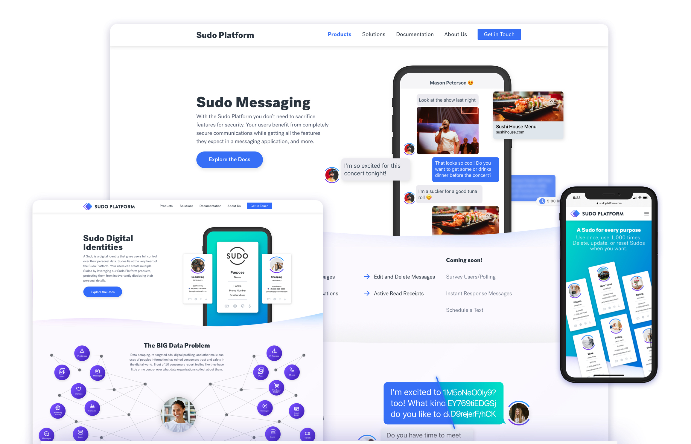
Sudo Platform Website
Dealing with ambiguity as a first-time project lead
Overview
Anonyome Labs was gearing up to launch Sudo Platform; a privacy & identity product platform. The Sudo Platform allows businesses to add a layer of privacy and security to pre-existing products, or the option to create an entirely new product for their customers to use to protect themselves online.
In order to get customers and sales in the pipeline there was a push to get the website out before the products were finished.
They needed a site that would set Sudo Platform up as a professional business and provide a home for all the information about their multitude of privacy & security products.
Timeline
Jan 2019 — Apr 2019
Deliverables
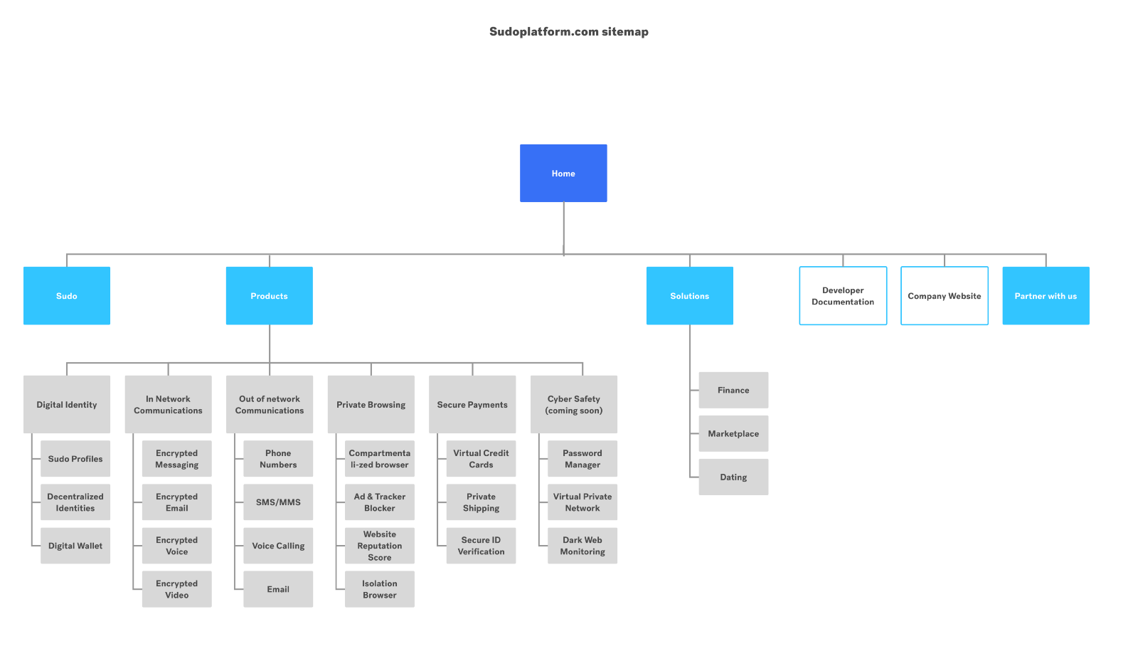
20 page website optimized for mobile
showcasing Sudo Platform's products
My Role
As a lead UX designer I saw the project from concept to launch. I conducted user interviews & audits, gathered content, designed page layouts and created graphics for each page. I also took the lead as the project manager by coordinating with team and stakeholders.
The Team
Brittany Keller (me) — Project Lead/UX Designer
Deyge Falanai — UX Designer
JD Mumford — CEO Stakeholder
Sudeshna Pantham — Head of Design
Jeff Poulton — Head of Product Stakeholder
Jon St. John — Solutions Architect Stakeholder
Tom Jensen — Developer
Toby Moncaster — Copywriter
The ultimate goal of the project was to help the company land a new partner.
Project Goals
Provide detailed infromation about each of Sudo Platform's products, while keeping Sudos at the core of the offering.
Provide B2C2C content for the company and establish Sudo Platform as a leader in the privacy & security industry.
Clearly distinguish the Sudo Platform brand and its products from other Sudo products (MySudo app & website).
The Task & Challenges
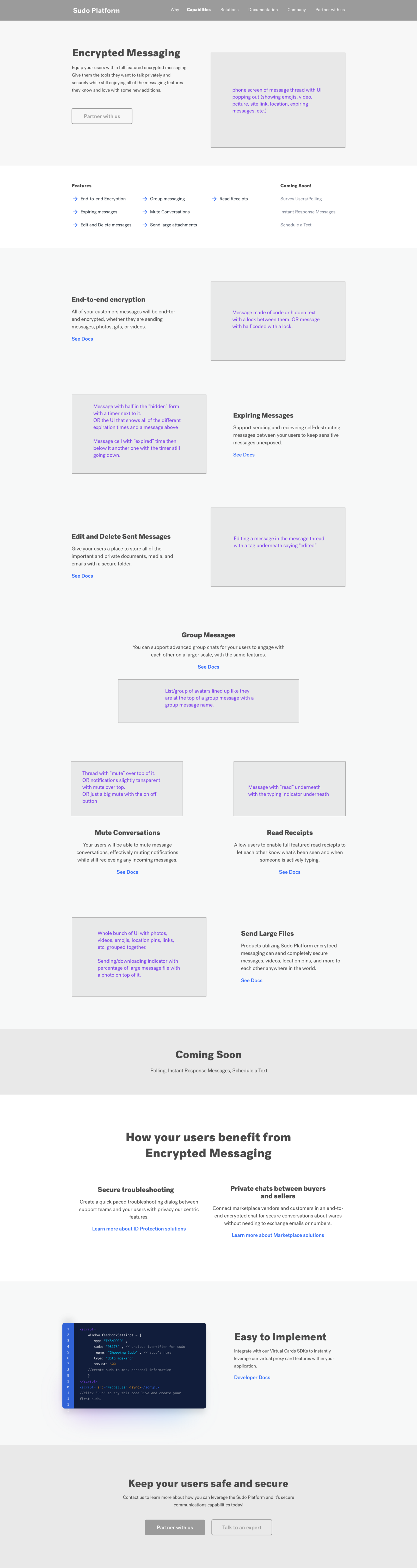
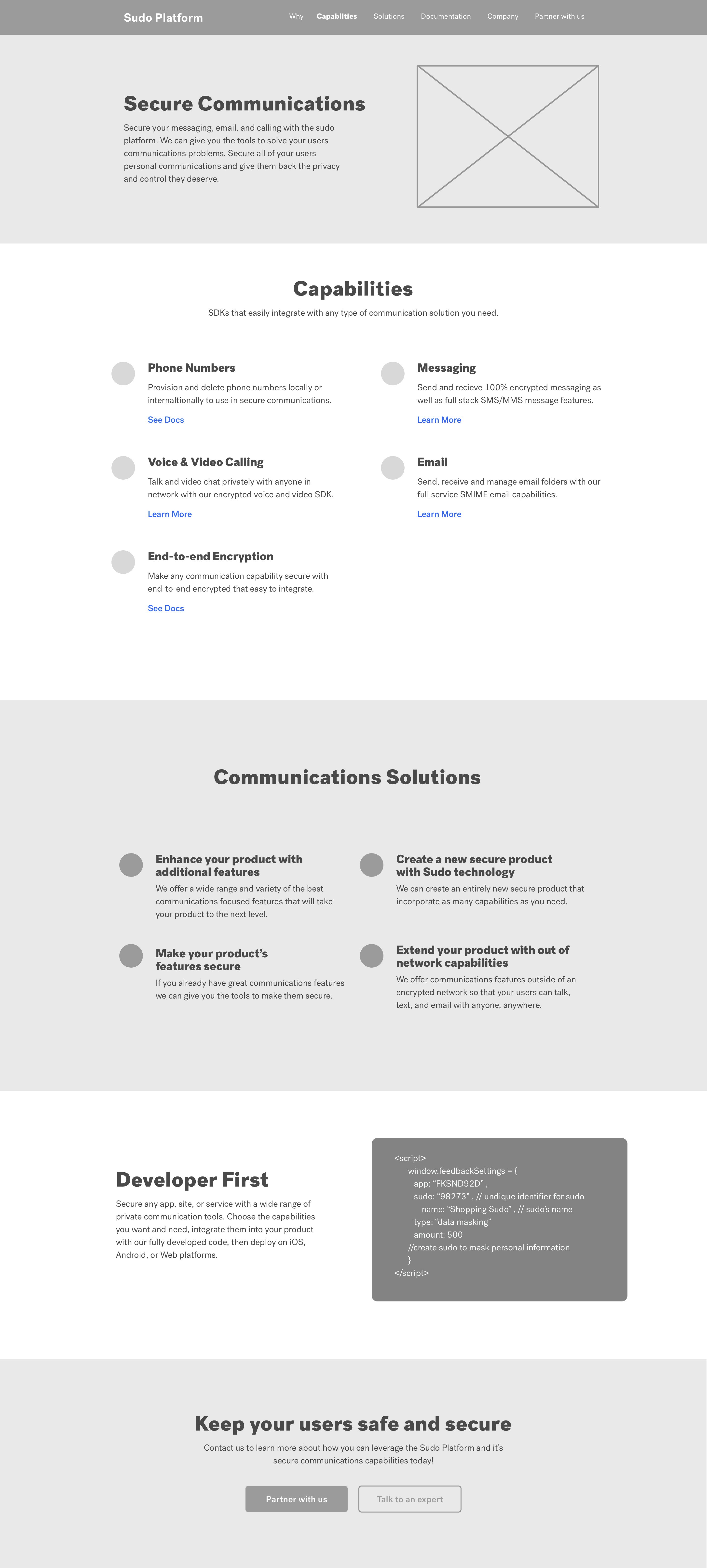
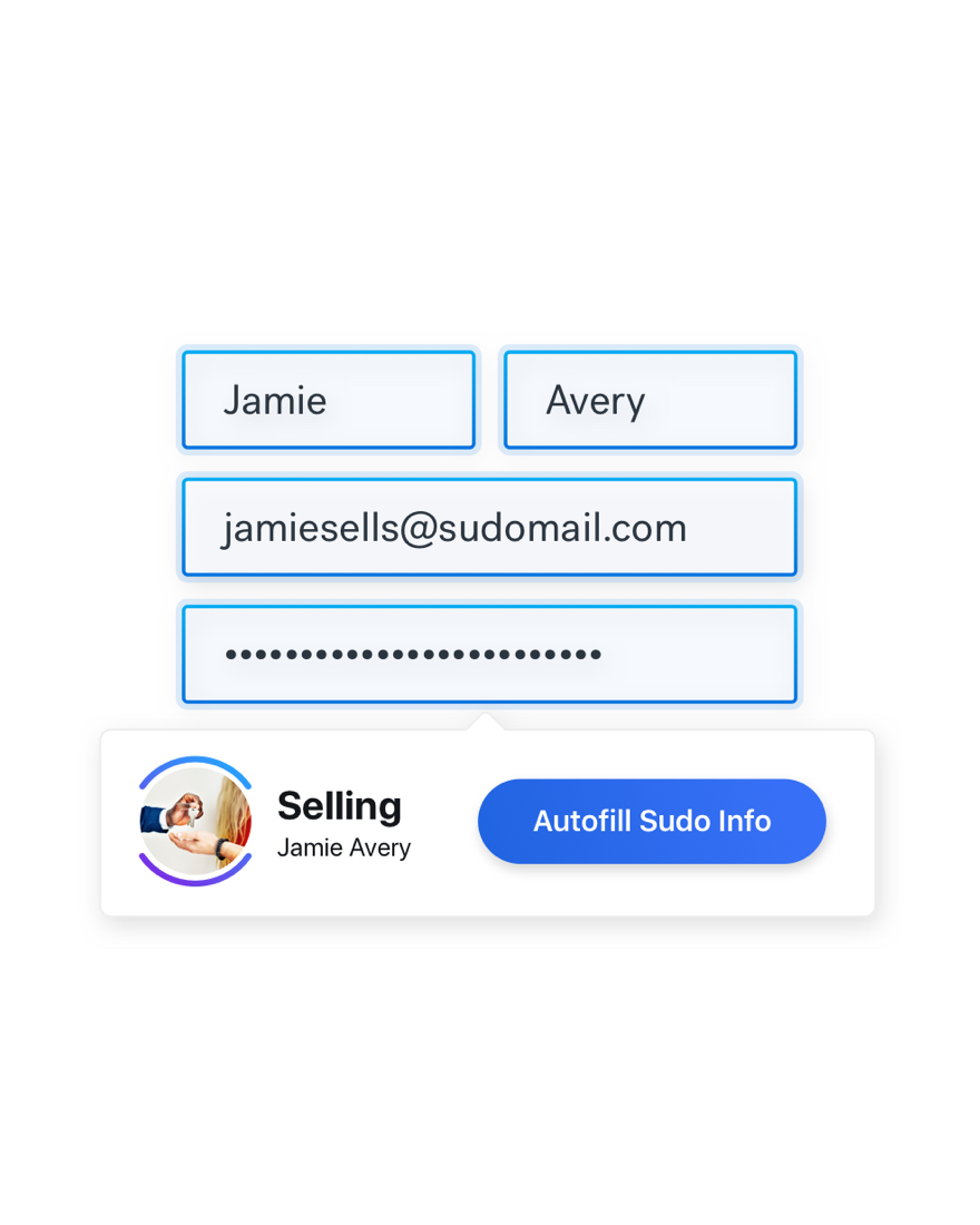
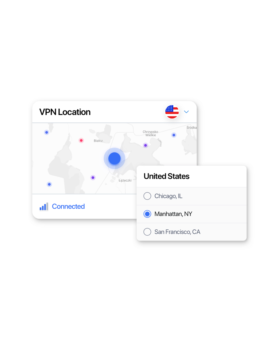
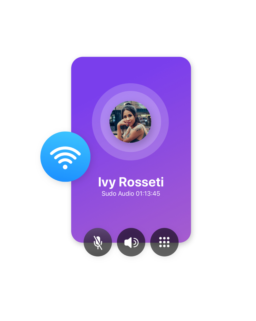
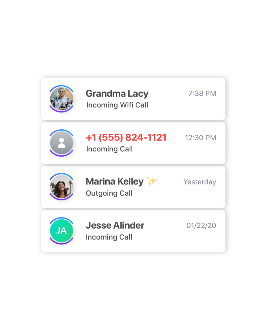
Create a website to show off the 20 products Sudo Platform has to offer. Giving special attention to Sudo Digital Identities which are the main piece of the platform. Highlight the product features and show examples of how each product might look like once integrated into a client’s product.
Ambiguity & scale ended up being the biggest challenges in the project.
Ultimately we were trying to create a website for products that were still in development with little to no solid feature specs or information. Making it incredibly hard to create detailed features pages about these complicated privacy and security products like; Isolation Browser or Virtual Private Network.
Besides the challenge of ambiguous products, the site itself was massive for our small team. This was an entirely new site that needed to be built from the ground up with completely new designs, layouts, graphics, and copy. This also included new branding to make sure it did not get confused with Anonyome’s other sites, while still feeling like part of the family.
The Process
Research → Conceptualize & Iterate → Design → Test & Review → Launch
Unqiue Research Challenge
Sudo Platform was at the forefront of the privacy & security industry. They were offering a highly unique set of products. In turn there were no direct competitors to compare with and audit, which added another challenge to our research.
Competitive Audit
What are other companies doing?
In order to build Sudo Platform up to content with other technology platforms out there we audited our competitors websites to see how they leveraged their products. There were no direct competitors, yet, so we tried to audit a variety of finance, identity, communication and privacy solution platforms.
How much detail do customers want to see on the site?
What kind of product displays resonate best with customers?
What voice is used when talking to customers?
Using these questions to reflect on while auditing each site helped us collect information that would be useful to us in the design process.
In total we audited: 7 sites
Key Insights
Keep technical information high level on the site, then go into depth in the docs. But always provide links to the docs near technical info.
Using simplified/mock UI works best to explain the concept, give an example of what the copy is talking about, and interesting enough to keep attention but not distract.
Copy should be short and sweet (mostly) if there are large blocks of text figure out how to chunk it out and use different font weights to break it up + add interest.
Secondary navigation within a category or capability is what everyone else does and works very nicely to keep the site organized and easy to find information.
Target Audience Interviews
What are you looking for from a platfrom site?
Because there were not customers for the products yet, we had to find creative ways to conduct our interviews. So we conducted interviews with people who could be potental customers for the platform and were customers for other software platforms in the past.
We interviewed 2 project managers to understand how they go about picking a service platform for themselves/the company to use.
What’s your process for looking into new technologies?
How do you compare similar solutions?
How technical of detail are you looking for?
Being able to interview project managers and understand what they look for when selecting a service platform gave us insights as to what should be included on the site as well as what kind of people would be visiting the site.
Key Insights
Understanding the product inside and out from the website as well as having an overview of all products or services included is key for the site.
Putting what you get right out of the box and providing examples of how much work it will be to integrate the product.
Getting a feeling for what a company is like from their site and what it’s going to be like working with them. Needs to look and feel professional.
The site needs information to satisfy multiple perspectives; Product Owners, Product Managers, Subject Matter Experts, implementation team members.
Persona Development
Personas lite.
Personas are obviously a very important part to the research phase of the UX design process. Unfortunately we didn't have time to create fully fleshed out personas for this project.
So we came up with the idea of personas lite.
A lite persona is something that would help up determine what kind of users we are targeting and what their specific needs & goals are for the site so we can tailor it to them better.
This kind of persona just states what their role/job is in a company and what their goals are when coming to the site.
Product Manager
- Easily find product capabilities.
- Determine if product fits their needs.
- Figure out the ease of integration.
- Easily compare this product to other solutions.
Project Team Lead
- Find product capabilities information on site.
- Easily find and go through developer docs.
- Fully understand product on a technical level.
Architect/Engineer
- Learn general product overview.
- Try example/code example to test out product.
- Understand how product will work for them.
Executive
- Understand solution on a high level.
- See product features on a high level.
- Contact provider for more information.
Pulling From Research
Key Elements to Incorporate

Copy will talk about the customers end user.

Use simplified UI graphics to show off products.

Incorporate an easy-to-see full product list.

Put technical details about the products in the docs.

Content should provide info for each kind of visitor.

Chunk product detail information out into sections
Conceptualizing & Mapping
It starts with a sketch.
Deyge and I began making a list of the different pages we thought the site should include, then once we had a consolidated list we made different sketches for what content should be included on each page & how it would be laid out.
We conducted a design exercise where we both drew a page of the site in a time-box, then switched sketches with each other and added to the other person's sketch.
Doing this exercise together helped us get an understanding of what the other design invisioning the site to be and what kind of content it would have. Once we were in agreement about the overall content, we were able to make decisions about what we should keep or add.
Wireframes
After many variations we landed on 2 different page templates to use across the site;
product & parent.
Product Page
Parent Page
Bumps in The Road
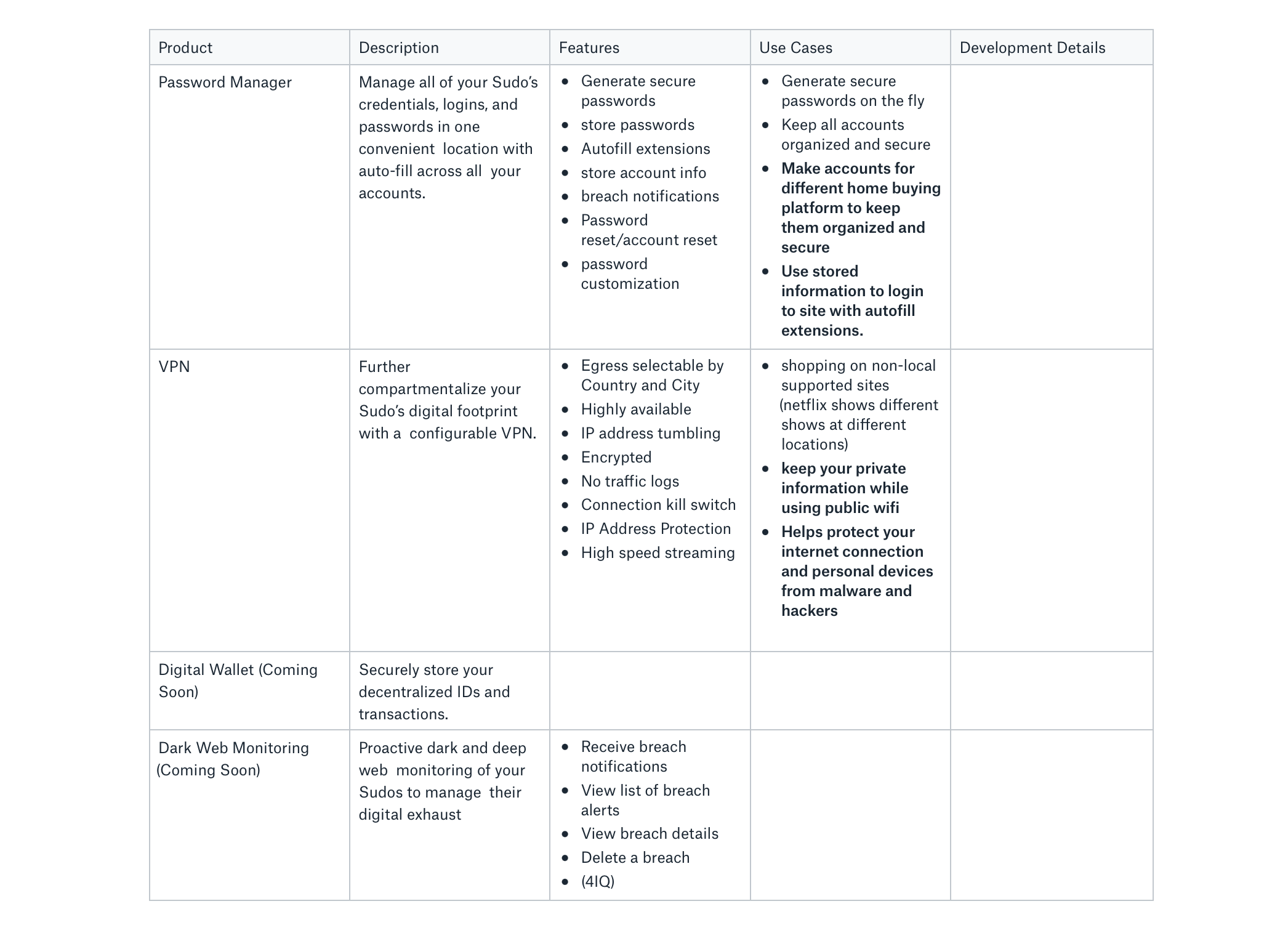
Do we have any content for this product yet?
As the wireframes and initial designs for the site became more solid we needed content to fill the pages. The only problem with that was that the product teams weren't ready to finalize the product requirements. But with no room for the website timeline to slow down we had to find some creative ways to come up with content.
We sat with the stakeholders for the project, who were also the ones in charge of creating these products, to help up gather the information we needed. We created a spread sheet that listed out all the products for each category, then places to fill in their features, use cases, a short description, and any development details.
Stepping into the PM role
Due to the small, start-up nature of the company with limited resources there was not an exclusive project manager role for this project. But as we got deeper into the project it became more apparent that the lack of a true PM was hindering our timeline.
As the small project team grew with the addition of a freelance copywriter and developer, someone needed to step in to delegate tasks, relay information and keep the project on track. So I decided to jump in and lead the project.
I began delegating tasks, coordinating with stakeholders, copywriter & developer, and maintained the project timeline.
Product Content Table: displaying relevant/finalized content and information about each Sudo Platform product.
Design
It's my time to shine!
Now that the ground work was laid, it was time for my favorite part of the entire creation process. Visual Design 
I tried to incorporate basic design principles into the graphics to keep them consitent, clear, and delightful.
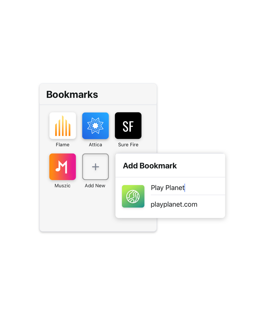
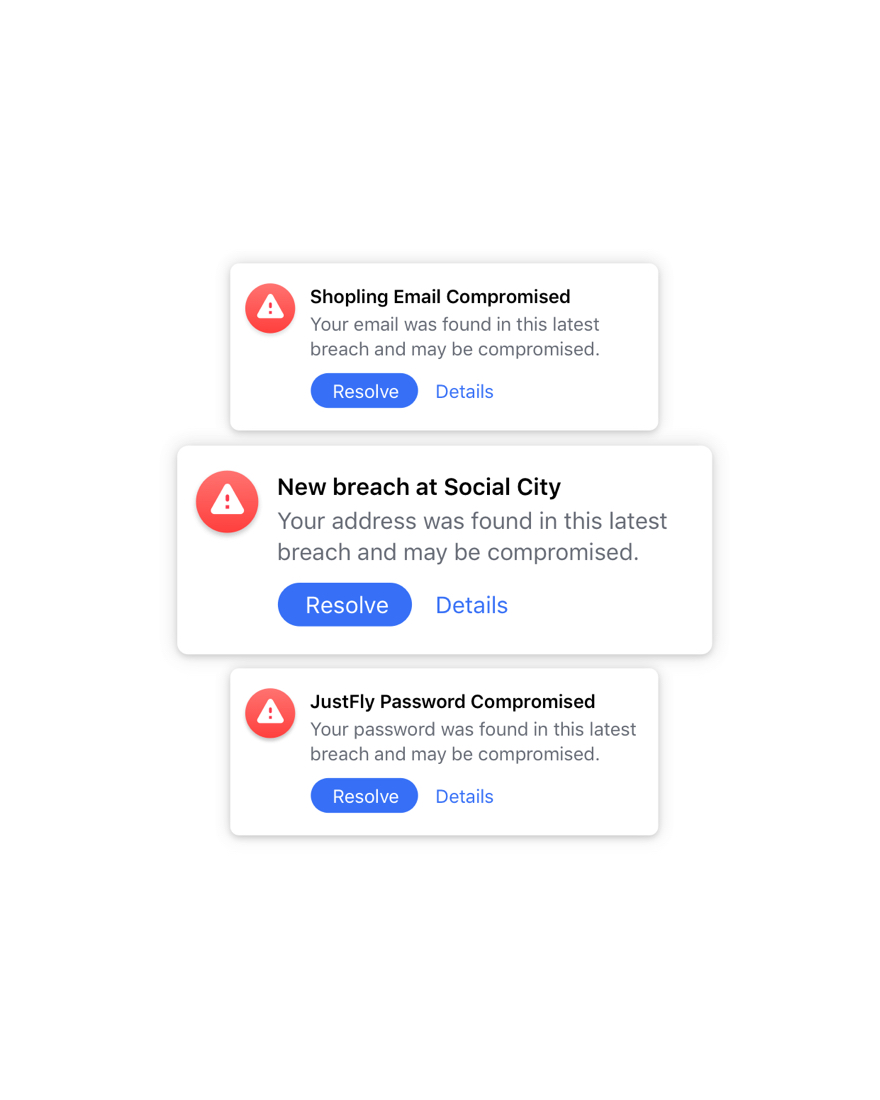
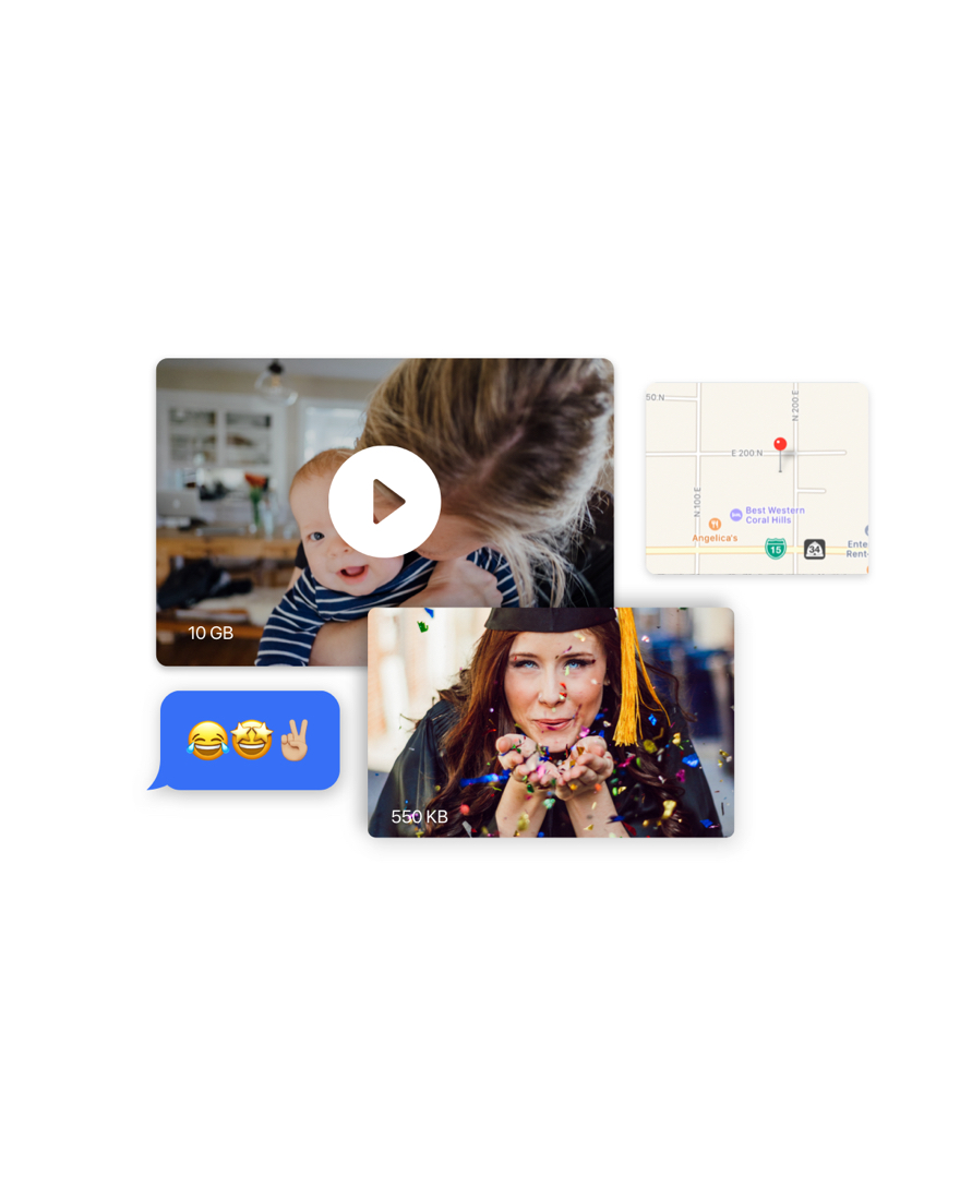
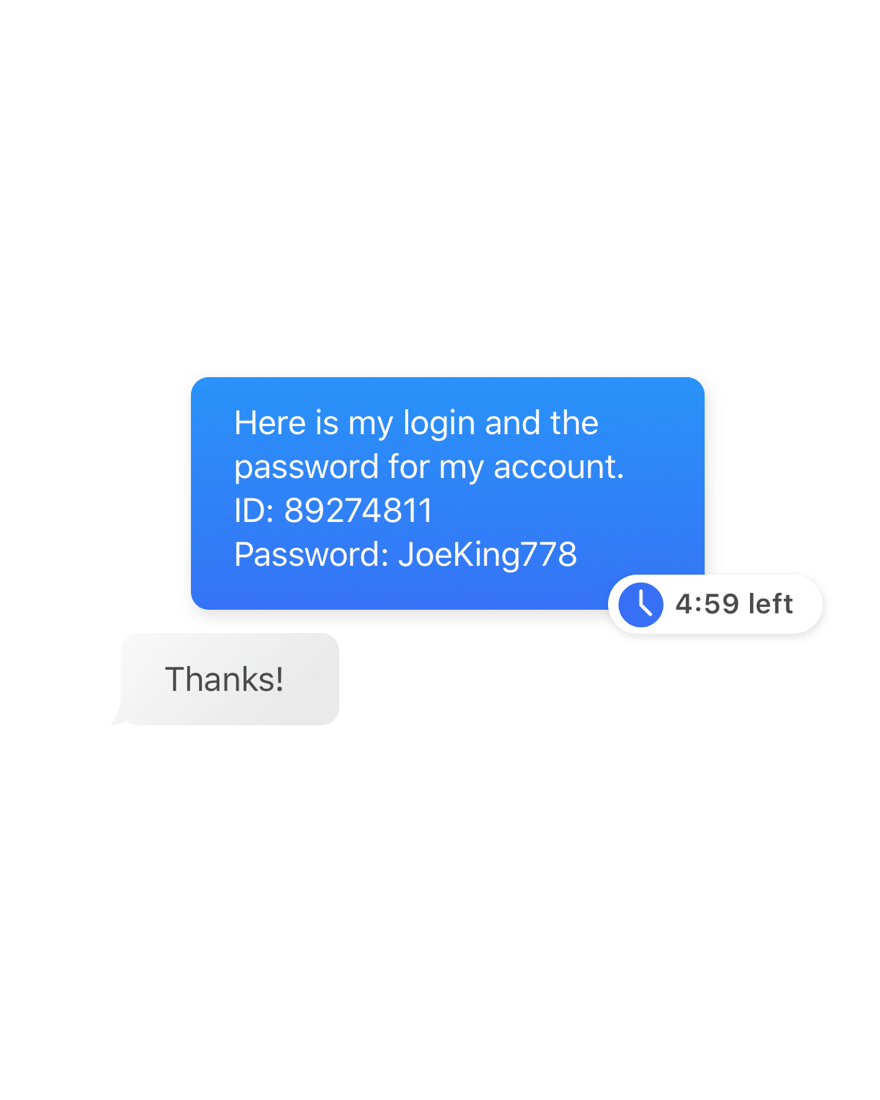
I began going to work on the graphics we were going to use to highlight features for each product. I based the style off of our research, trying to make them delightful but obviously not completely real UI from our products. In total I created over 40 graphics.
Design Principles Used:
- Balance
- Movement
- Repetition
- Contrast
- Proportion
Final Desktop Designs
Development & Launch
We had a successful launch despite all the challenges.
With all of the challenges we faced over the course of this project, it was amazing that we were only a week late with the launch and a little bit over budget.
We launched late mainly due to last minute copy changes. Much of the development finalization time was taken up by our developer going back and editing the copy on the site based off of stakeholder feedback. There were also a few design items and visual QA that slipped through the cracks due to such a tight schedule.
It felt amazing to have this beast of a project go live for all the world to see. Plus, Anonyome landed a partner 8 months after the website launched.
With all of that in mind, if I could do it again I would have pushed back on the launch date, I think trying to cram so much in lead to mistakes and didn’t give me enough time to thoroughly check the preview versions of the site. This lead to frustration on the stakeholders end when they looked at the site and saw things that were out of place or glitchy.
It was a learning experience with a beautiful outcome.
Final Takeaways
Pay attention to detail — thoroughly check your final designs and website previews.
Make sure stakeholders are confident in their copy, and push them to explain why, if they are not.
Do not be afraid to push to a longer timeline if needed, if you don’t have enough time mistakes are bound to happen. It’s better to do it right the first time.
Next Up: Connecting lawyers to their legal staff with a simple and effective communication tool
Links
Made with love
©BrittanyKeller 2023