Sidebar Messaging
Connecting lawyers to their legal staff with a simple and effective communication tool
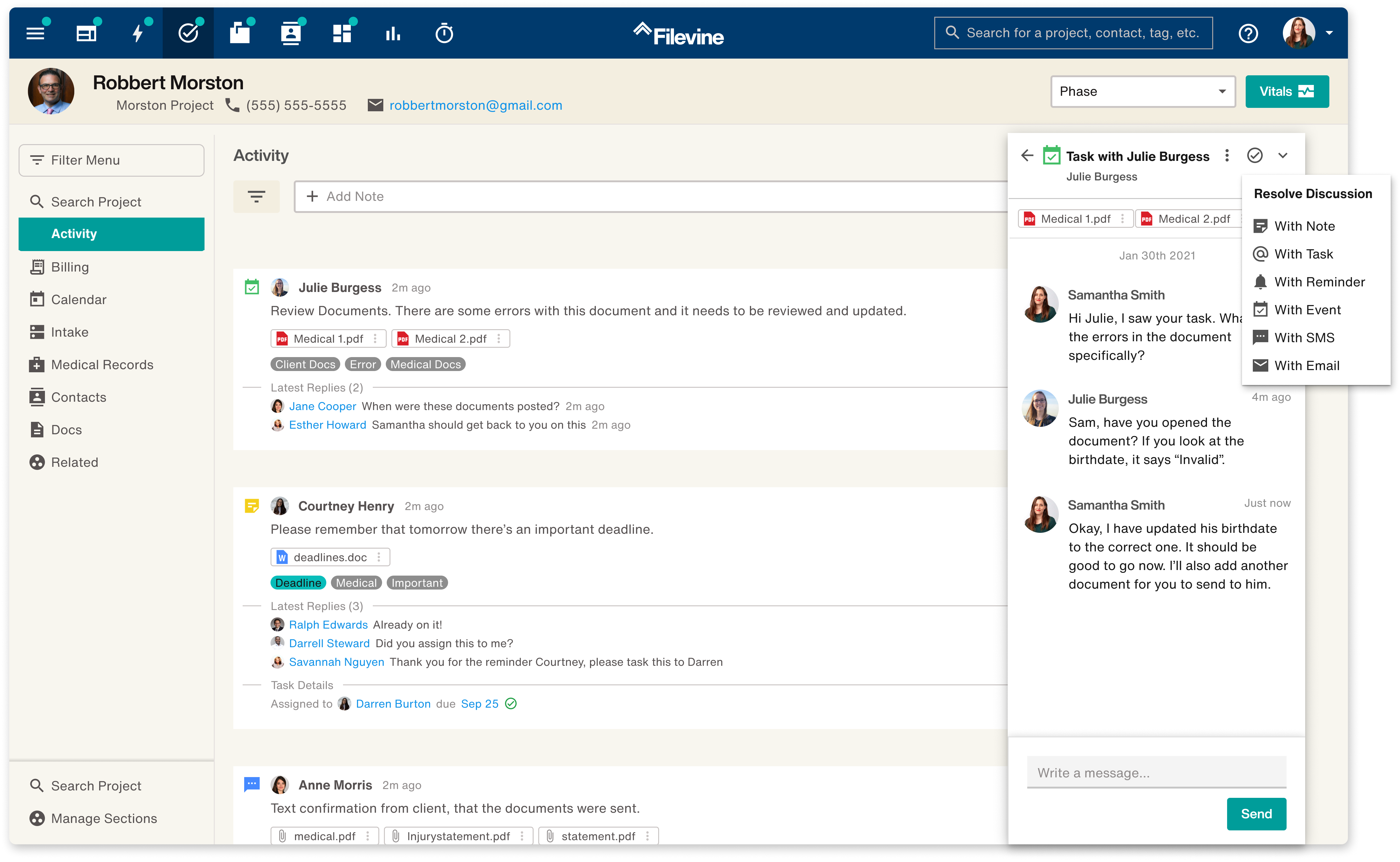
Overview
The current communication functionality in Filevine wasn’t effective or efficient for users. In order to message more easily, they would use software like Slack or Teams to communicate outside of the platform.
Filevine wanted to keep users on the platform and give them a better way to communciate.
I lead a design sprint that helped my team come up with a solution that made communicating inside of Filevine simple, efficient, and effective. Keeping users inside the platform and cutting down their need to context switch.
Timeline
Jan 2022 - July 2022
My Role
As Senior UX Designer for this project I lead this project from start to finish. Owning and leading the design sprint that helped us come up with a solution. Then myself and another designer created all of the screens and saw it through the development process to launch.
The Team
Brittany Keller (me) — Senior UX Designer
Samantha Ferreria — UX Designer
Brandon Kirk — Product Owner
Chris Bishop — Lead Developer
The Problem
Simple messaging inside of Filevine does not exist. The current notes functionality forces users to dig through hundreds of notifications to find message replies — things get lost easily or missed completely. If they choose to communicate outside of Filevine using Slack or Teams they are fighting to figure out message context and keep a record of it.
Discovery & Research
Our Communication Issue
One of my Product Owners brought up a project that he had been stewing on for a couple months. A new and improved communication platform for Filevine. He had been working there for far longer than myself and over his time had caught onto the issues with our current 'Note' functionality.
I myself had noticed during observations at law firm onsites that our users often had hundreds or thousands of note notifications in their feed. In order to communicate they used slack, or went old school and called each other on the phone. Or even more archaic and straight up knocked on each other's doors.
On the outside, it could seem harmless. But we both thought there could be larger issues being caused by this constant interuptive communication.
How it impacts our users
1. Having so many notifications makes it so that the important things slip through the cracks. But when you are a lawyer or law staff, those important things can make or break your job.
2. The stress of making sure you keep track of the important converstations and the info that is said inside of them leads users to constantly be checking their notifications. Keeping them distracted from their actual work.
3. Being distracted leads to being less effecient with your work and feeling more exhausted at the end of the day.
Problem Breakdown
1. Notes and notifications are hard to keep track of but they make it easy to find the context around the message or task you are looking at.
2. Using Slack/Calls/Door Knocking is more effective, but leads to more interruptions and digging through content to find context for each message.
3. More interruptions leads to more distractions which leads to unhappy and stressed our users who already have a stressful job.
The Idea
Create a messaging platform within Filevine, that allows users to effectively communicate in a way that feels more intuitive than the current Notes functionality to cut out other messaging platforms and lessen daily distractions.
Expanding & Iterating
How do we turn this idea into an actual solution?
Run a Design Sprint
An idea is great, but this idea was so ambiguous and had so many paths for exploration it could turn into an absolute mammoth of a project.
In order to come up with a more clear and actionable solution we ran a 5 day design sprint with 3 product owners, 2 other designers, 1 UX researcher, and 2 developers.
You know what they say, "fail fast, fail often"
Design Sprint
Set Goals → Journey Map → Sketch Ideas → Design Prototype → User Test → Solution
Step 1
Goals & Sucess Metrics
Our Goal: Allow users to have focus and intuitive conversations with each other, while enabling them to find and engage with existing context and tasks without needing to eject from their current task flow, hunt down context elsewhere, or start a new thread.
Quantiative Metric: Notable increase (10% or more) of tagging/tasking of users and task status movement/completion.
Qualitative Metric: When users leave the office they feel like they were able to focus on their work and were only interrupted for valid concerns
Step 2
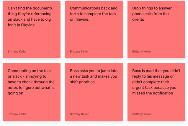
Journey Maps & Pain Points
We chatted with 5 users about what a typical day in their life might look like at work. During those interviews we created a journey map and mapped out their communication related pain points.
Step 3
Sketching & Solutioning
We ideated different solutions for the issues we found our users had. Taking HMW notes, doing crazy 8s sketches, and eventually refining sketches and voting on the best solution(s).
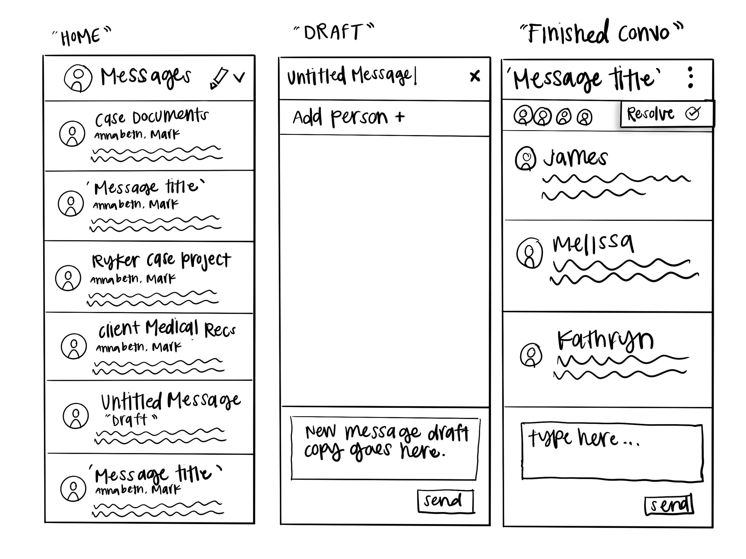
Key ideas to incorporate in our final solution
Messages with context – Give users the ability to start messages from documents, notes, or tasks
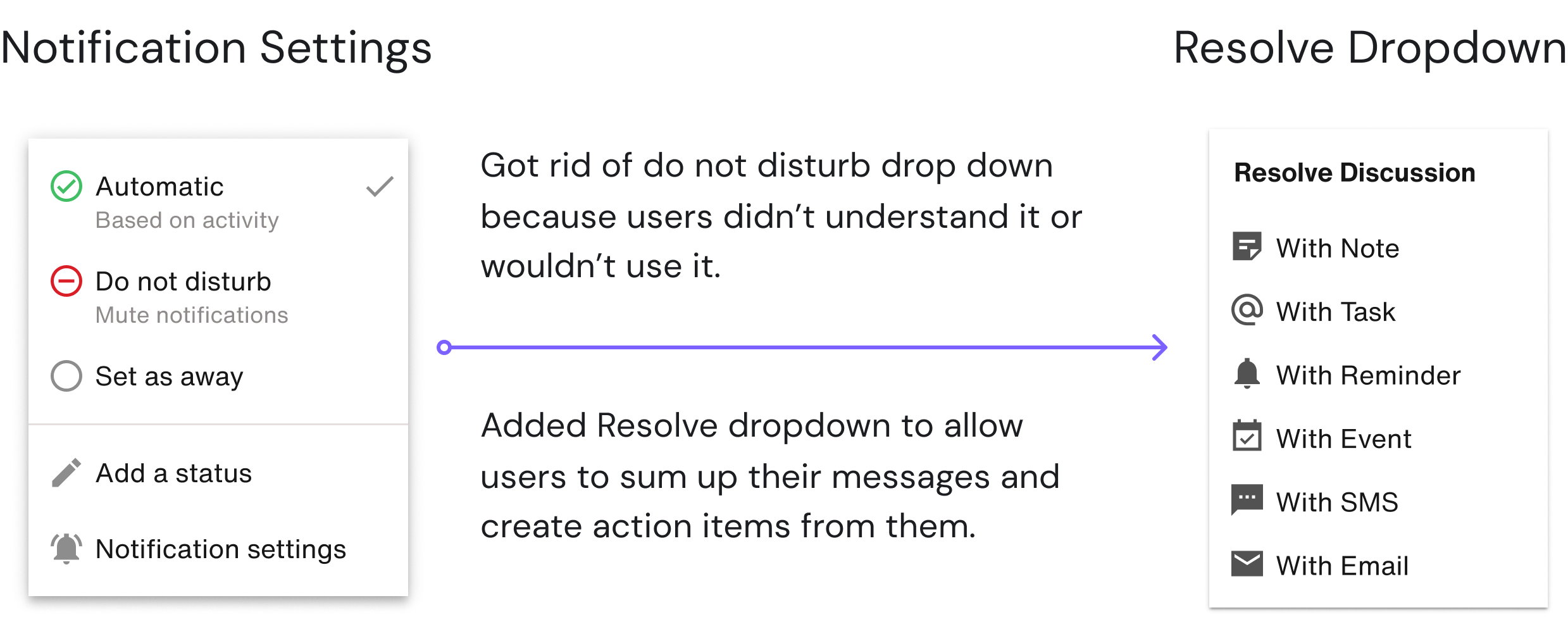
Do Not Disturb Mode – Give users the ability to have time to focus on their work and not be interrupted by messages.
Message Privacy – Give users the ability to have private messages with one person, or a group message.
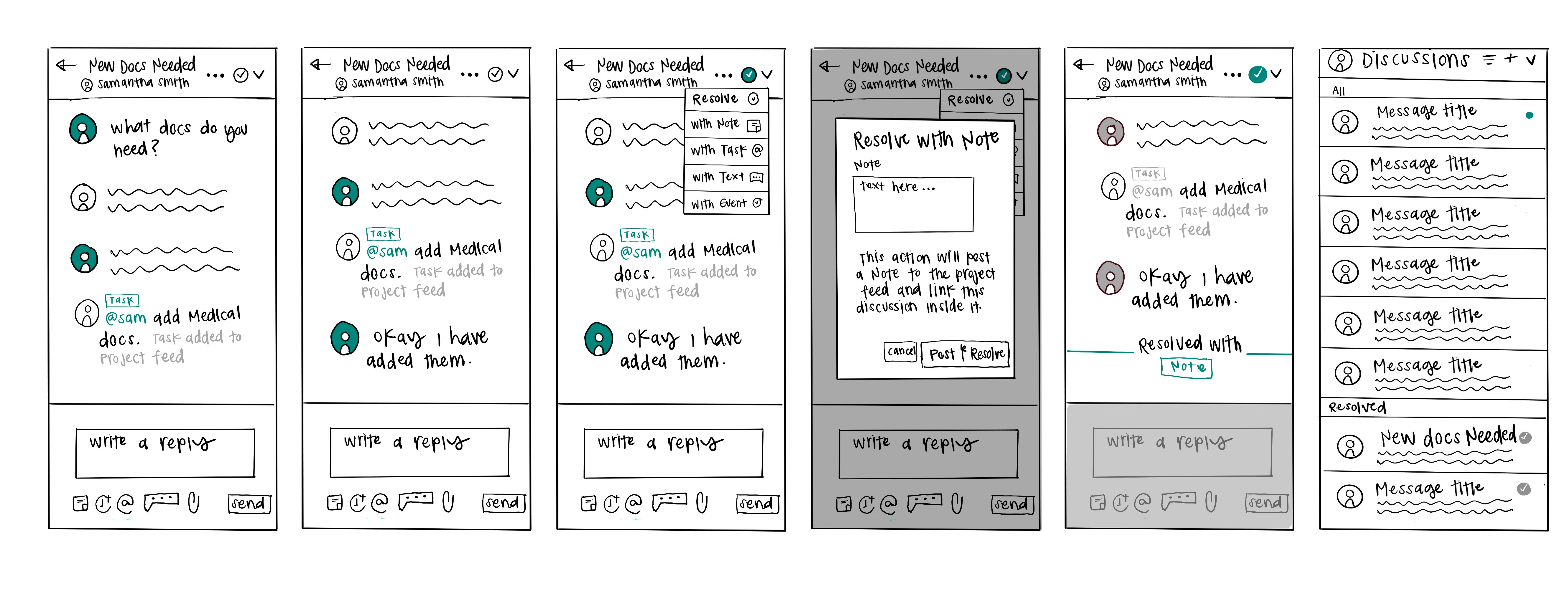
Resolve – Give users the ability to resolve messages once they are done with them so that messages don’t pile up and become another burden to check.
Step 4
Designing & Prototyping
Collectively the team came up with our solution. Now it was the designers time to shine and bring the idea to life. Myself and 2 others designed out the screens and put together a prototype to bring to our users.
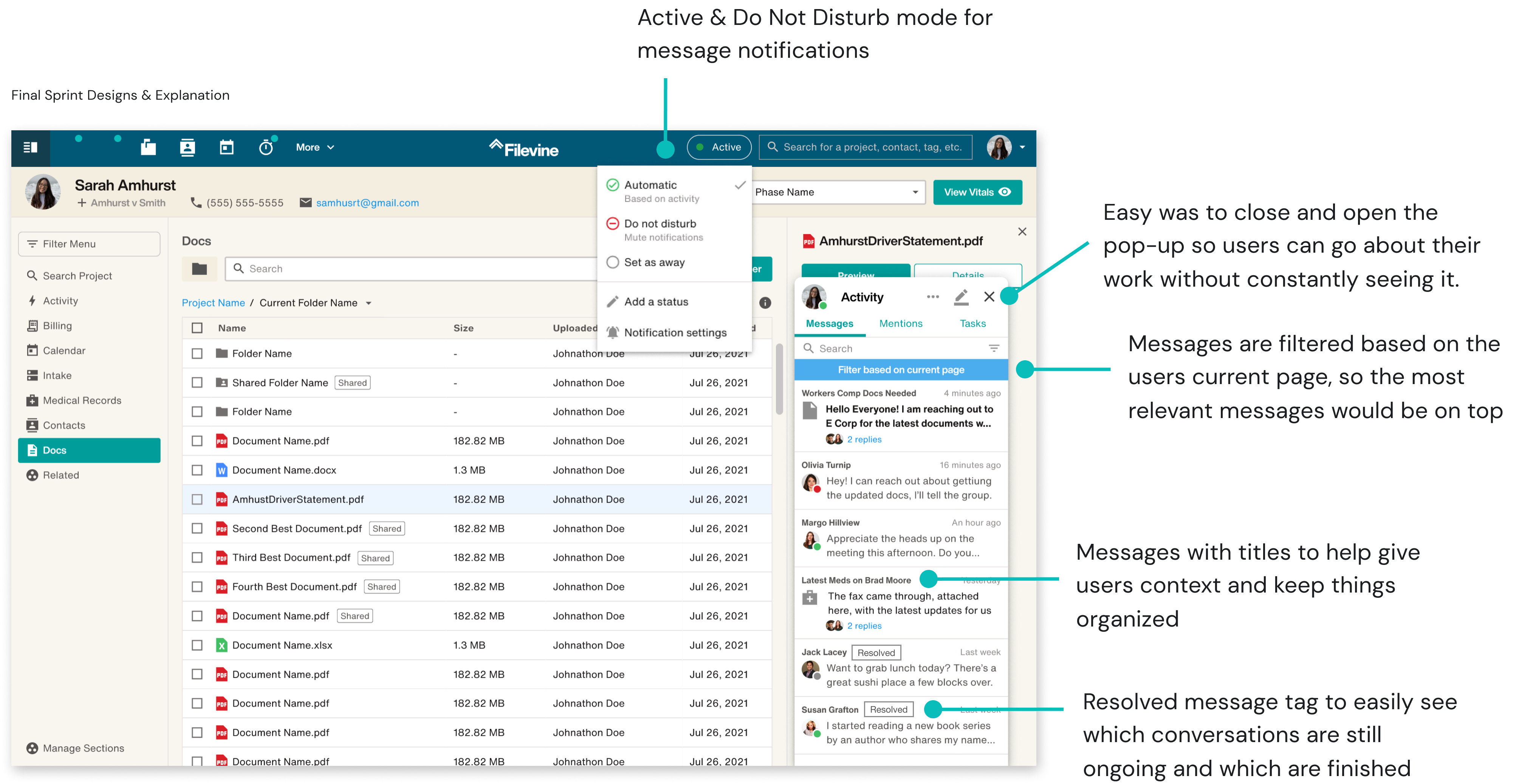
Prototype Flow
Prototype Flow
Step 5
User Testing
With our final prototype in hand we brought it to users to get their reactions to the concept we came up with. A side panel that held all of their messages and allowed them to start a conversation with someone about a certain topic and easily be notified when they had a new message.
The Results
Messages with context – Users liked the ability to have context around the discussion and linking documents directly into the thread.
Do Not Disturb Mode – Most users in management positions didn’t like “do no disturb mode” or completely misunderstood its use.
Message Privacy – Users wanted a way to record information said in private messages but keep what was private out of the record.
Resolve – Being able to create a task/resolve the conversation confused some users, we need to create a way that is more seamless.
The Solution
A self contained side panel for users to briefly chat with each other about an attached subject matter, then easily resolve the conversation with an actionable item if necessary.
Dig In & Expand
Now that the ground work for the solution was laid, it was time to dig in and flesh out the designs and really work through how certain aspects of the product would flow and function...aka more sketching.
Resolve Flow Sketches
Design & Iterate
Once everything was worked out and approved, we went about perfecting the look and feel of the screens and designing out all the users flows we would need. In order to make life easier for ourselves we created a mini component library based off the larger design library for
the company and got to work.
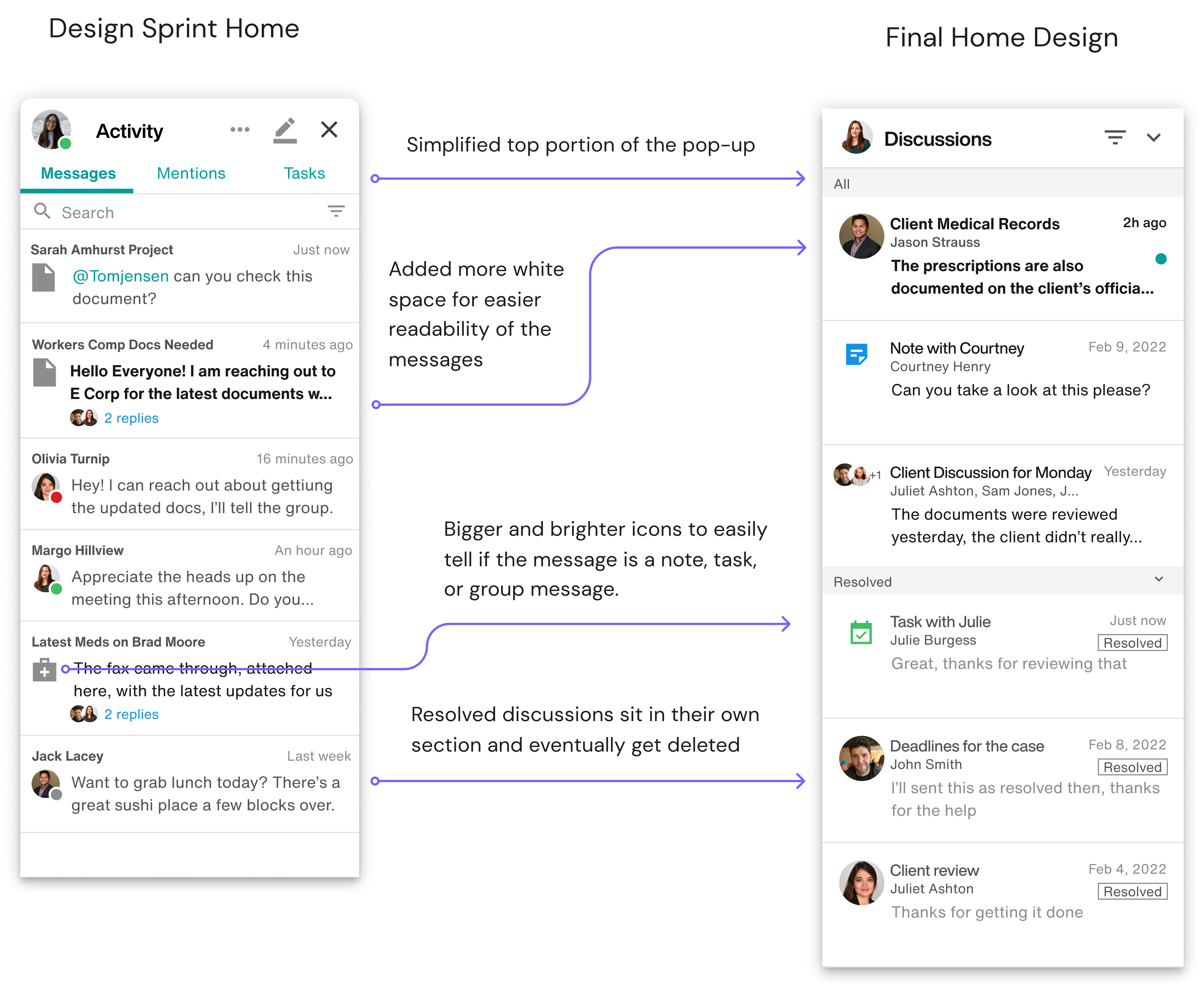
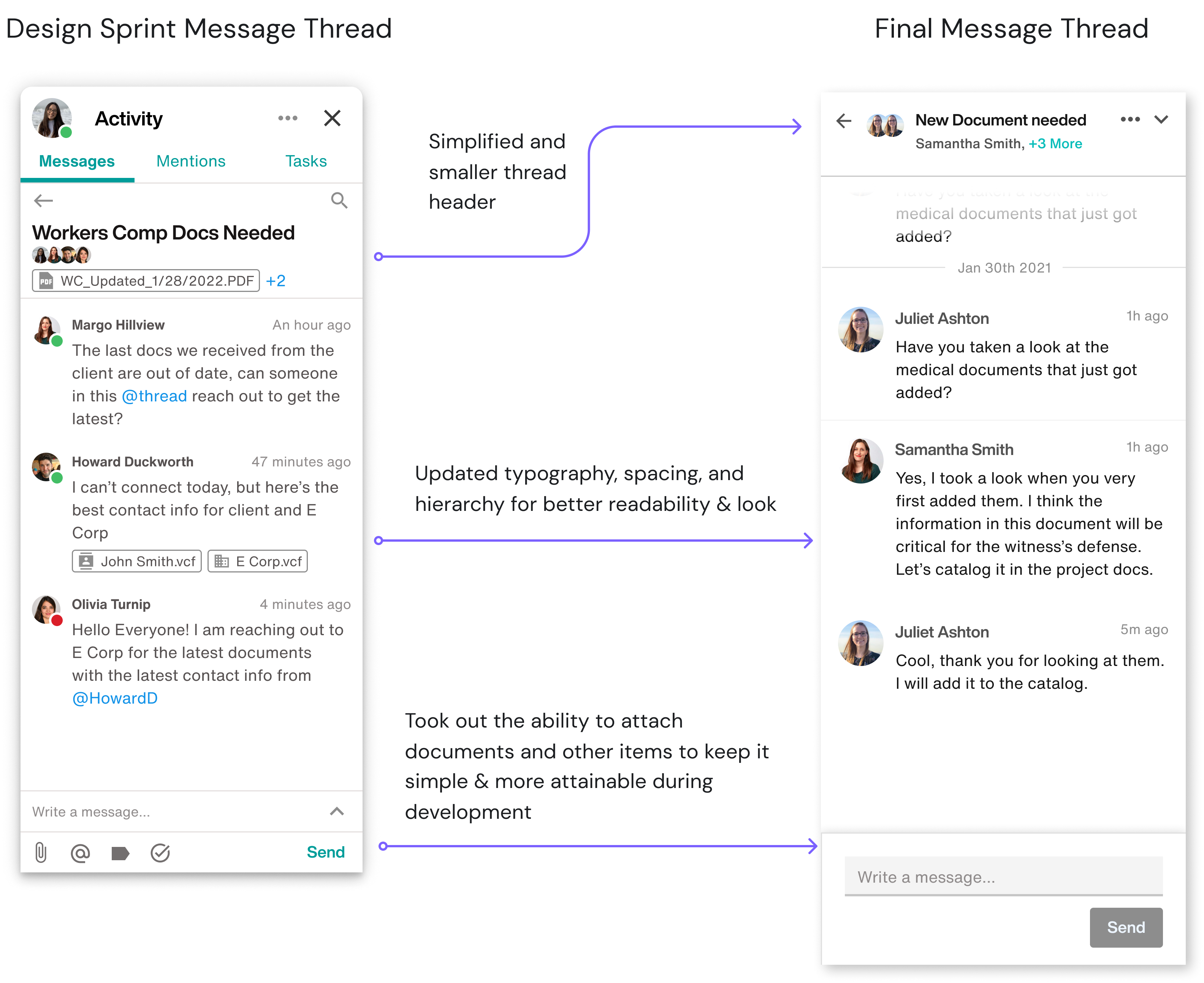
Final Designs
Hey there, this is the default text for a new paragraph. Feel free to edit this paragraph by clicking on the yellow edit icon. After you are done just click on the yellow checkmark button on the top right. Have Fun!
Challenges
Development
One of the biggest challenges in the project was being the guinea pigs for a new development style the company was experimenting with. The work needed to be chunked out into 6 week cycles, so myself and the PM decided this was the best way to chunk out the work:
1. Creating the foundational pop-up container and ability to write messages
2. Building out the resolve functionality and adding a resulting action item
3. Adding the functionality to start a new discussion from an artifact and adding additional artifacts
Final Takeaways
If something feels too big or too ambiguous, sprint it out.
Running the design sprint really set the tone for collaboration between product owners, designers, and developers.
The beta for Sidebar ended up landing Filevine a contract for $150K.
Ask users what they want and they will say a faster horse.
Next Up: Customizable, Cross Platform Browsing Apps
Links
Made with love
©BrittanyKeller 2023
