Safe Browsing Apps
Creating customizable browsing apps for iOS, Android and Web
Overview
Anonyome was gearing up for a deal with its first Sudo Platform partner. It was time to hunker down and bring their privacy solutions to life.
It was the biggest project I have ever been a part of, spanning across the entire company and every team in it. Design played a major role, being involved from conception to launch and influencing the product requirements.
There was a push to create these initial designs to be completely customizable so that everything could be reused when selling to other partners.
There were 3 cross-platform products in this first launch; VPN, Password Manager and Safe Browser, but I am going to focus on the safe browsing apps in this article.
Timeline
Sep 2020 — Feb 2021
My Role
As one of the lead UX designers I helped build the component libraries, conducted research, created designs & user flows, and collaborated with PMs & development teams to see the products from conception to launch.
The Team
Brittany Keller (me) — Lead UX Designer
Wayde Mecham— Lead UX Designer
Benn Eichhorn— Project Manager
Platform Development Teams
The Task
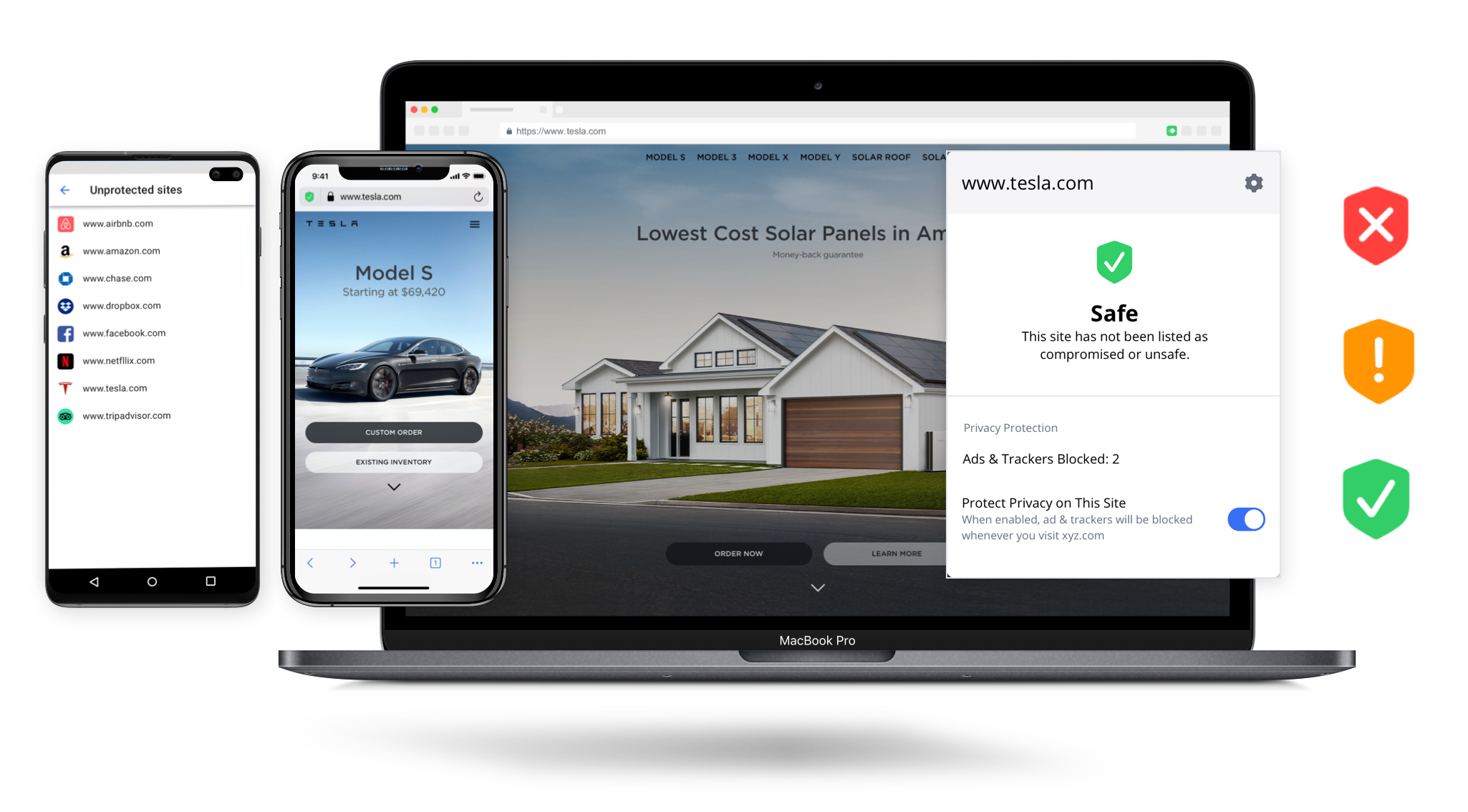
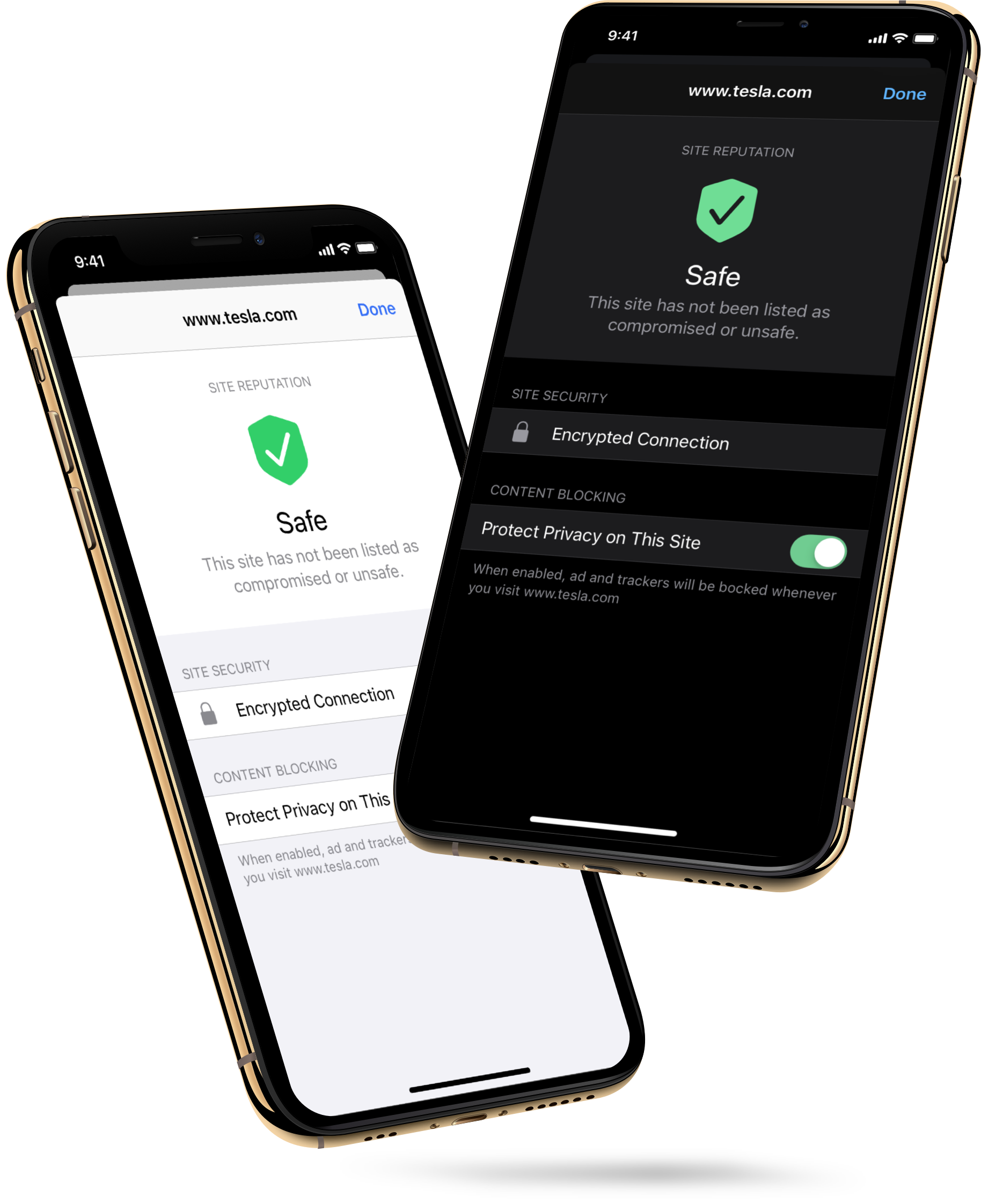
1. Creating designs for a safe browsing app for iOS & Android and a safe browsing extension for Web. The apps would include safety and privacy features like secure browsing history, unsafe site alerts, ad & tracker blocking, and site reputation scoring.
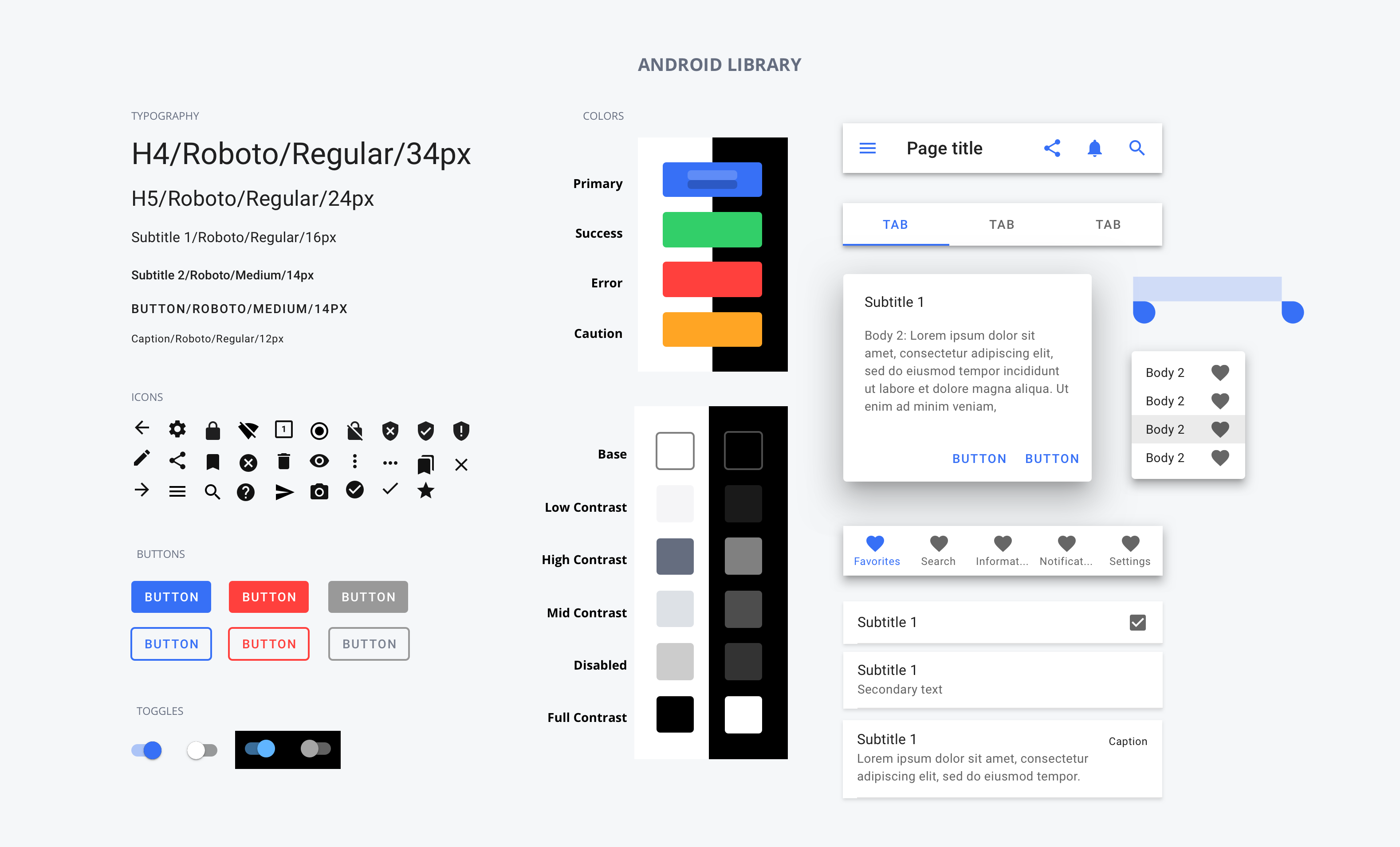
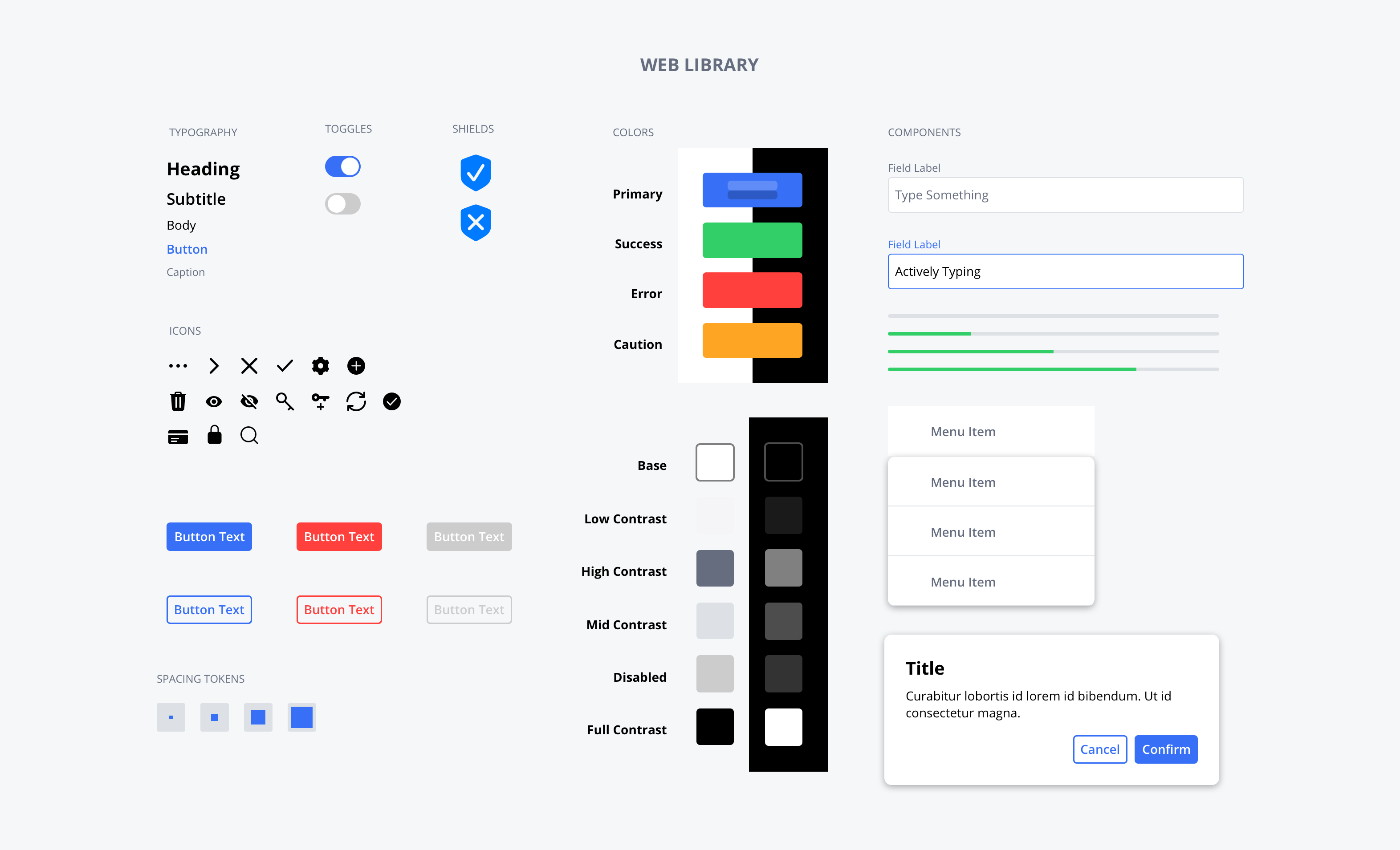
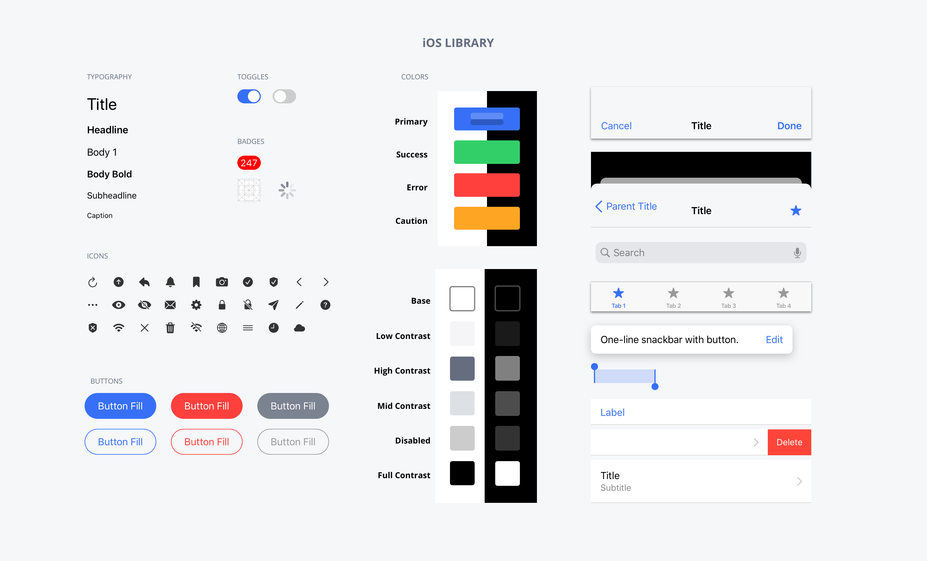
2. Creating customizable component libraries to make rebranding for other customers easier down the line. We created large component libraries for iOS, Android and Web, then smaller libraries for each specific product.
The Challenges
1. Creating designs before development requirements were set and having a complete understanding of what was technically possible.
2. Working across teams and timezones. The mobile dev teams and project managers live in Gold Coast Australia, making a 17 hour time difference.
3. Finding a happy medium between the best UX and the company's bottom line when determining MVP designs.
The Process
Build Libraries → Research → Iterate → Design → Develop
Building the Libraries
Customizable & configurable.
The idea was to build a hierarchy of libraries to use to design all of the Sudo Platfrom Products. We created large component libraries for iOS, Android and Web which served as our base libraries for all the Sudo Platform products. Then we created smaller libraries for each specific product and platform to keep things light and easy to use.
We started with the base material design library and iOS's design kit for the mobile apps, then built an entire web library from scratch. We added some of our own custom icons and type styles, then went through and made sure each component, color and icon could be easily switched out and customized.
It was a long process with some trial and error to get everything working properly, but it was well worth the effort and project front load to make things run more efficiently down the line.
Some Context Before We Dive In
What are the safe browsing apps & what do they do?
The safe browsing apps are security oriented browsers on par with Brave and DuckDuckGo. They offer users the ability to browse privately, block ads & trackers and see site's safety scores, being informed when they visit unsafe sites.
Research
What's the standard?
Since we were desiging for our customer's users we had to understand what kind of people they were. After recieving some information about their users we dedcuted that most of their users were privacy newbies and we should try to keep our products simple and standard.
We conducted competitive audits on the leading private browsers out there; DuckDuckGo, Brave, Firefox Focus, and Safari.
We found that privacy features ranged depending on what kind of browser they were. The more privacy oriented browsers like DuckDuckGo and Brave had the most features and were in your face about it. While FireFox Focus and Safari had ad and tracker blocker features but they weren't completely obvious about what they were doing to keep users safe.
Key Standards
Everything a normal browser does with private browsing history and browsing protection.
Ad & Tracker blocking controls, usually with one universal one and more granular ones.
Site Score Grading of some kind (B+, 70/100, Safe)
Number of blocked ads & trackers, either globally or from site to site.
Iterate
Driving the product requirements.
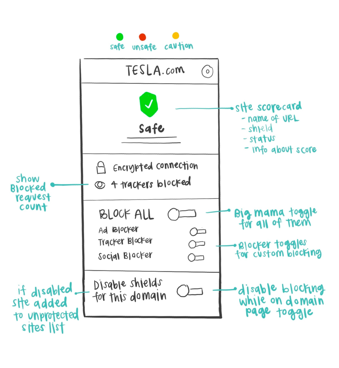
We were able to drive the product requirements based off of the standards we found in our research and the type of users we knew our partner had we came up with some items we believed should be included in our privacy browser apps .We worked with the project manager to create a rough list of product features and how it should work and collaborated with them when writing stories and sprints.
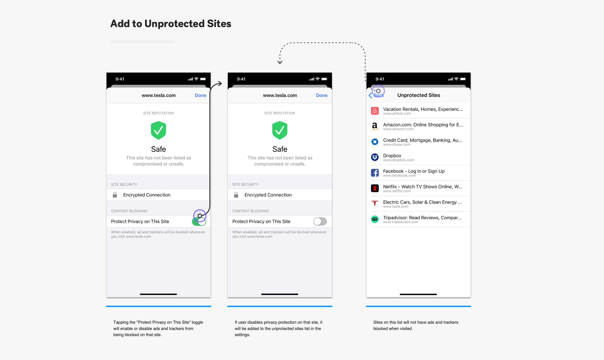
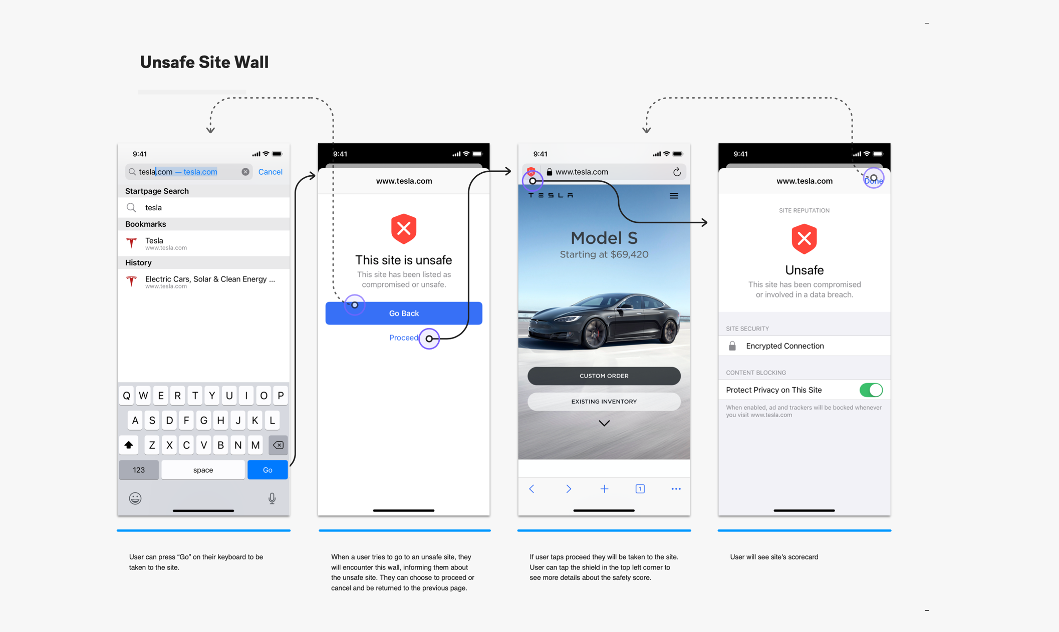
We created rough sketches and worked with the project manager to create rough user flows to work through difficult problems. The main one being how our site reputation score would work and how users would add sites to an unprotected sites list while still trying to keep them protected.

Rough flow conceptualizing how the unsafe site wall will work & adding a site to the unsafe site list.
Design
Start with the best and cut back.
Once we had a general idea of how the product should work and what should be included we set out with a rough list of requirements and tried to design for the best UX possible.
We knew that we would have to cut back on things later, but creating the most idealized version to start helped us direct product development and push for features we knew the product needed.
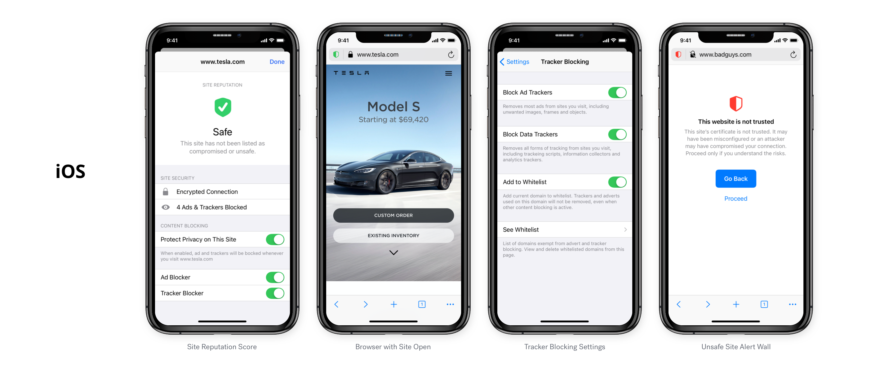
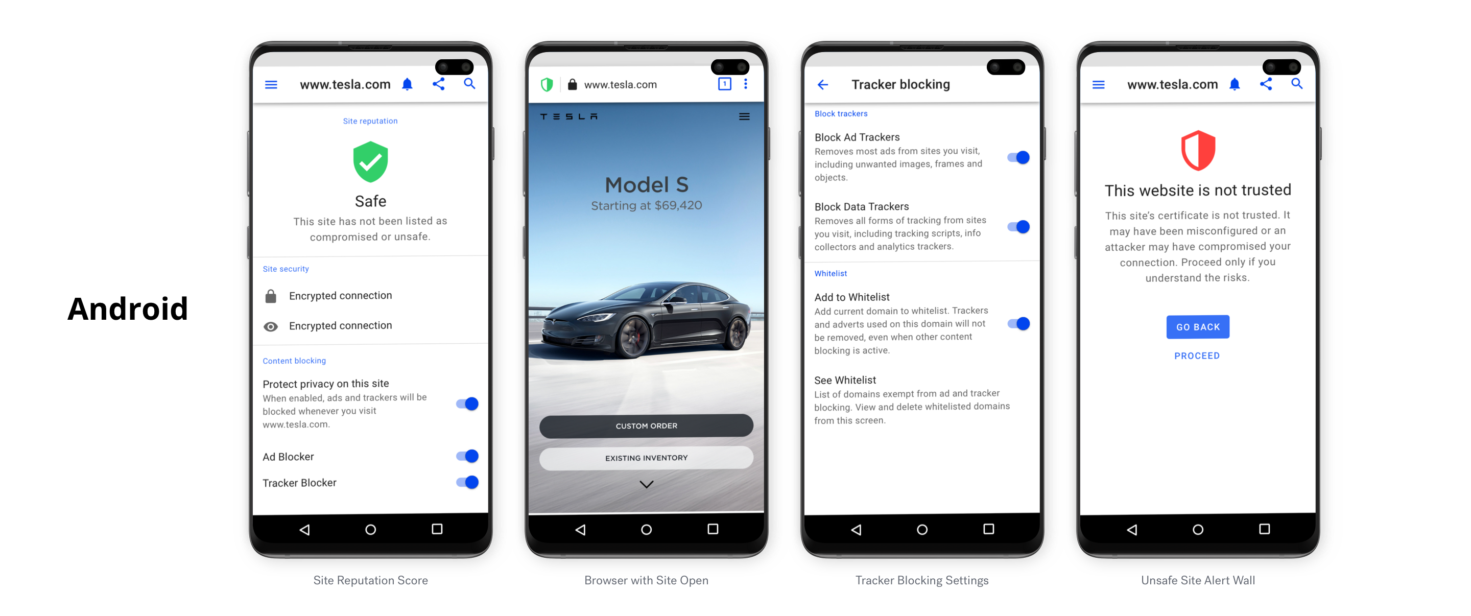
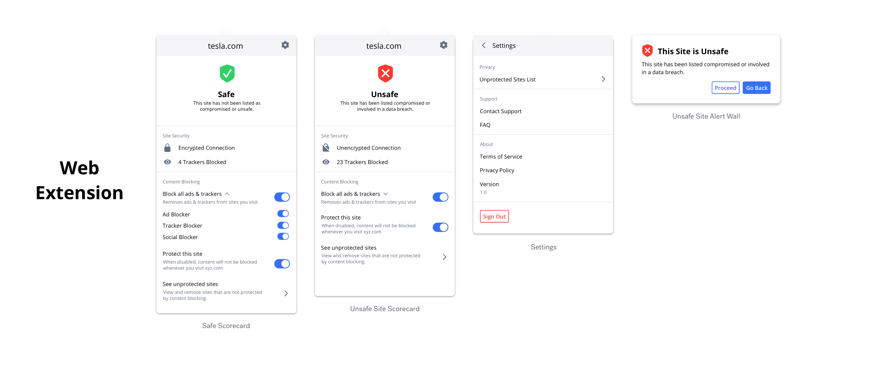
We designed the products in tandem for consistency across platforms, with a few breaks here and there on the browsing extension. It was nice to be able to pull from our pre-created component libraries and made the design process so much faster.
User Flows
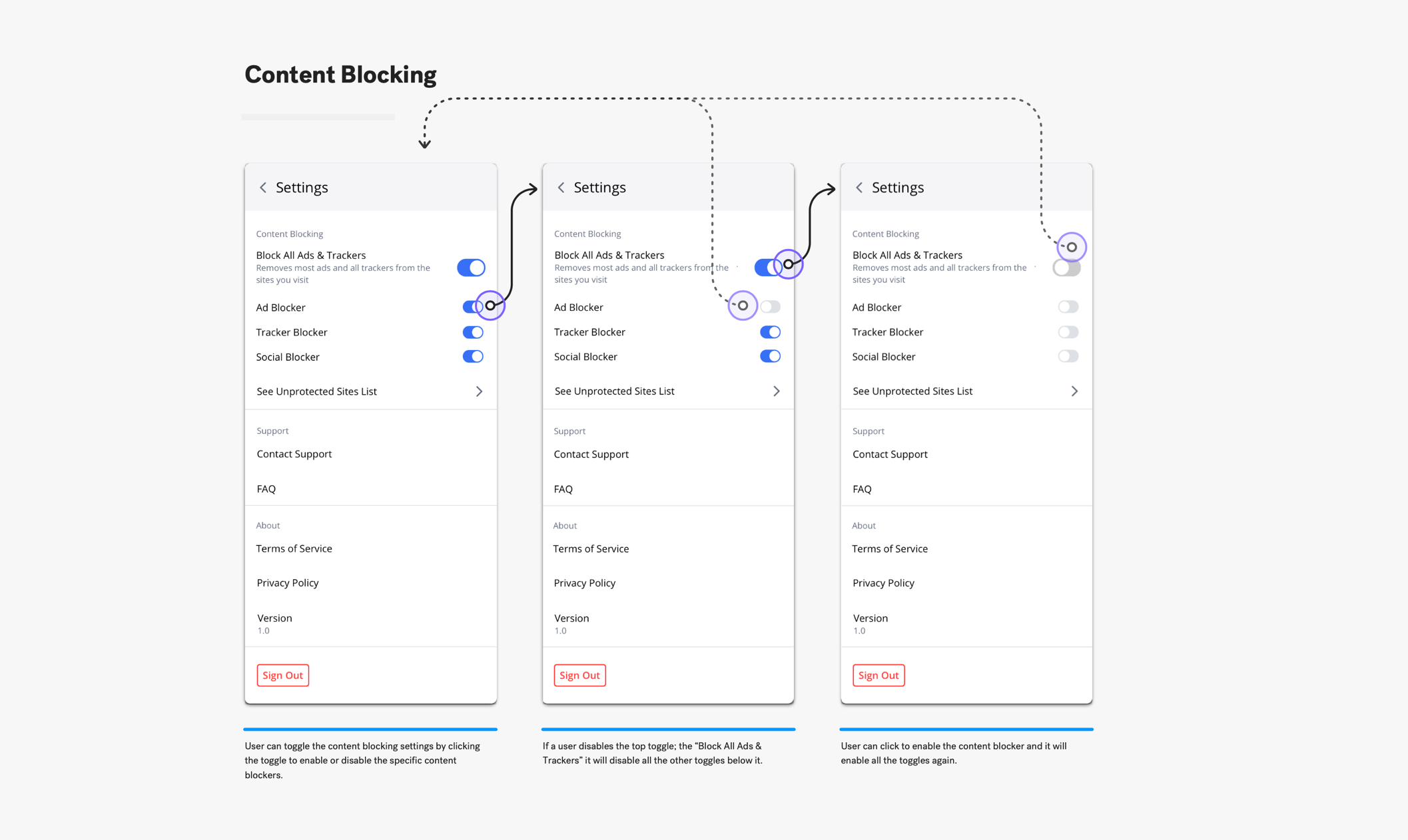
I created user flows to help explain how we invisioned the apps to work to the developers and stakeholders. We also used them to show the partner how our apps were going to work and seal the deal with them before final development.
Below are a few flows explaining the more complicated flows in the browser apps.
Development
Reviewing & updating
Okay it's later.
We reviewed the products with the PMs and the different development teams (iOS, Android, Web), using the ideal user flows to show off how we wanted the products to function. There were some discussions and push backs from the dev teams about the difficulty and technical limitiation of the features we wanted.
Certain items had to be taken off or changed in order to reach the project deadline, which we knew would happen. Now it was our job to decide which features needed to make it to MVP and which could be saved for later.
It proved difficult to get everyone on the same page at the same time over such a variety of timezones, but we ended up with MVP products that everyone was happy with and roadmaps to continuing improving the products to their idealized versions.
The browsing extension had the most changes made to it from start to finish. This was one of the products that had a lot of unknowns about it, so it was expected. Below explains the changes made from each point in the review process.
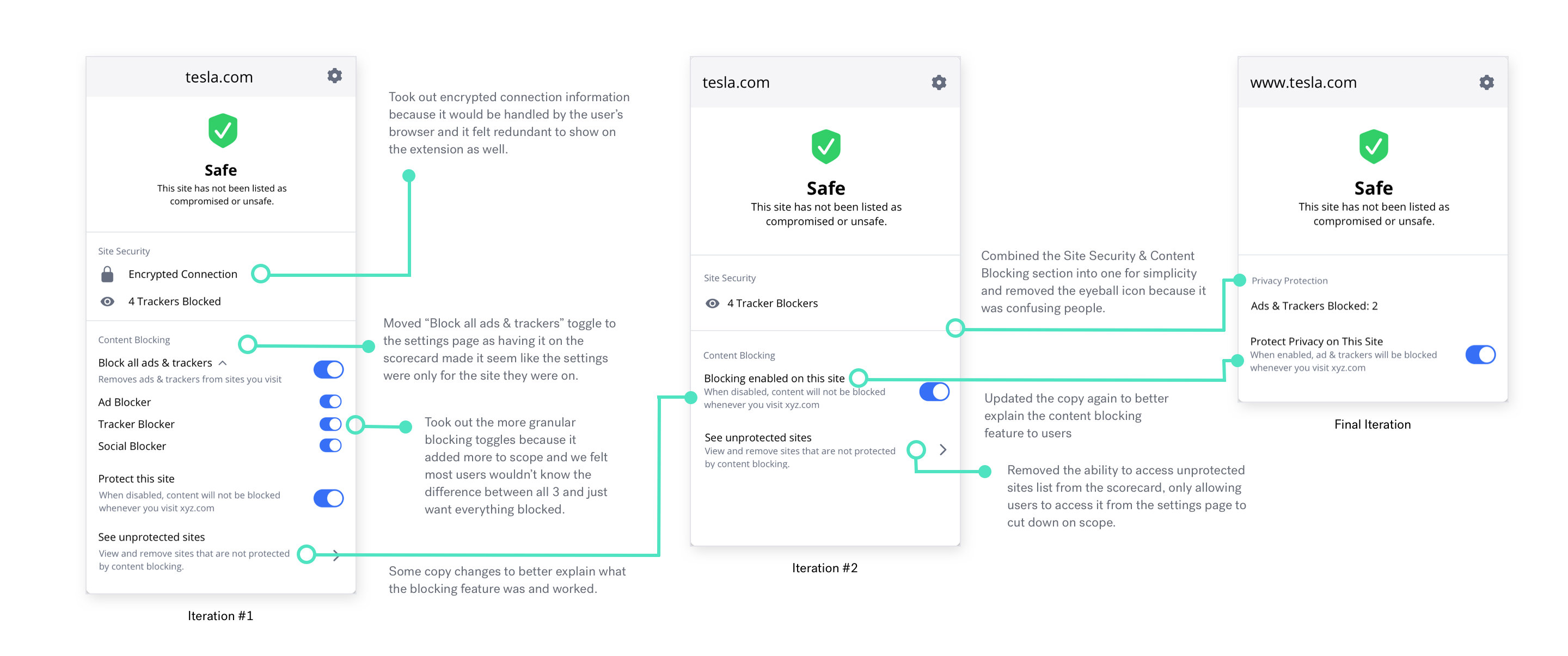
Finding Balance
As UX designer I believe it is our job to find the right balance between what is best for the user and what is best for the company.
We had to cut back on features that made for better UX because it was out of scope and budget for the company.
The challenge was determining which features could be cut while still maintaining a good user experience.
MVP Solutions
A Balancing Act.
Final Takeaways
Even though building the libraries heavy loaded the project it was completely worth it. It helped so much with the ease of the project down the line and made it easy to keep everything consistent across platforms and products.
There was a lot of change that had to happen between design reviews for the products, but it was for the best. There were some items that had to be cut back for the MVP, but it was good to simplify the products and find a balance between what was right for the company and what was right for the user.
Next Up: A Big Ol' Website
Links
Made with love
©BrittanyKeller 2023
